
Smarter tracking, splitting, and managing of everyday expenses.
Cashcare
Objective
To design an app that provide seamless integration, intuitive insights, and user-friendly interfaces, leading to an efficient financial management.
Scope
A budgeting app that offers personalized financial insights, and an engaging user experience to empower users in managing their finances.
2 weeks
Duration
UX research
UX/ UI mobile design
Prototyping
Responsibilities
Figma
Tools
Design team
Team
Process
The entire process included three phases - Research phase, Ideation phase and Execution phase
Research
Desk research
Primary research
Competitor Analysis
Ideation
Gather insights
Problem statement
Design goals
Execution
Wireframe
Screen prototype
Prototype testing
Synthesis
User persona
User journey mapping
Identifying problems
/User Surveys (Understanding real problems from real users)
RESEARCH
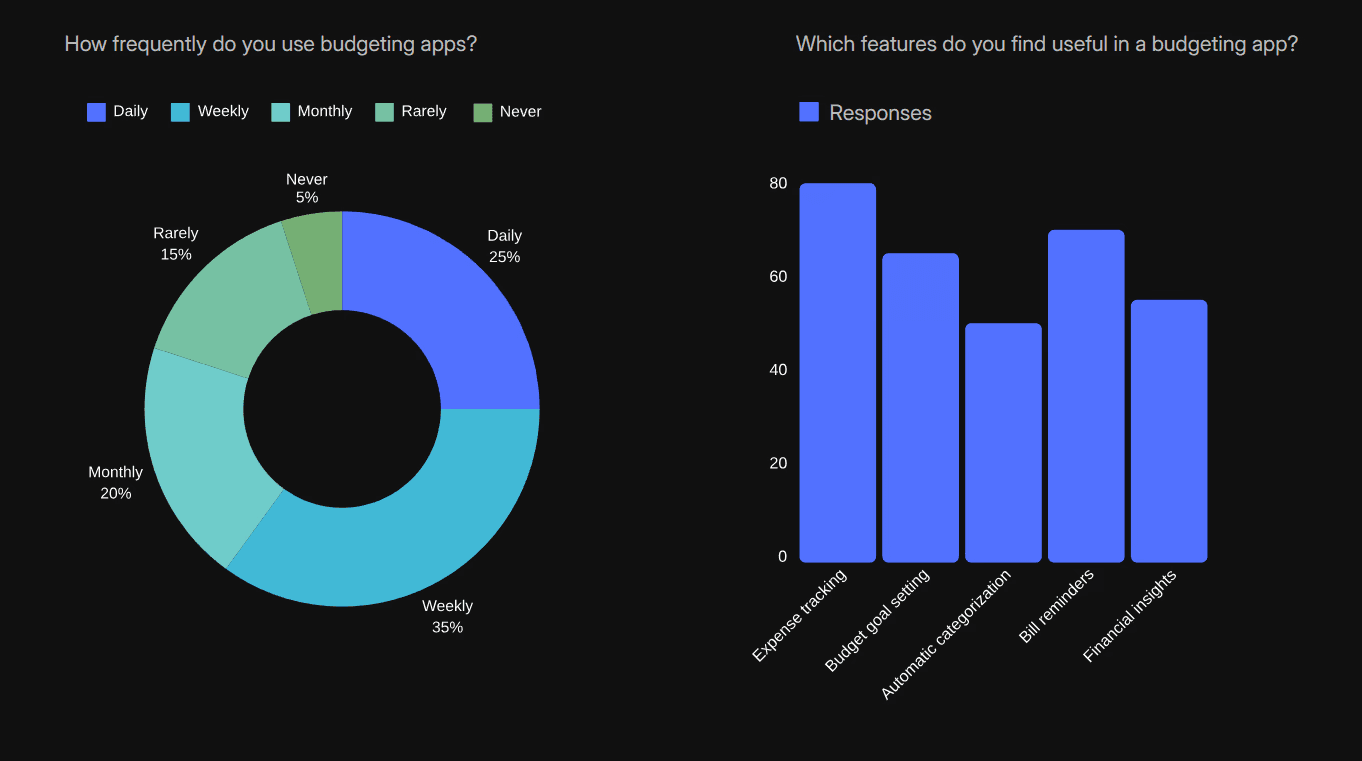
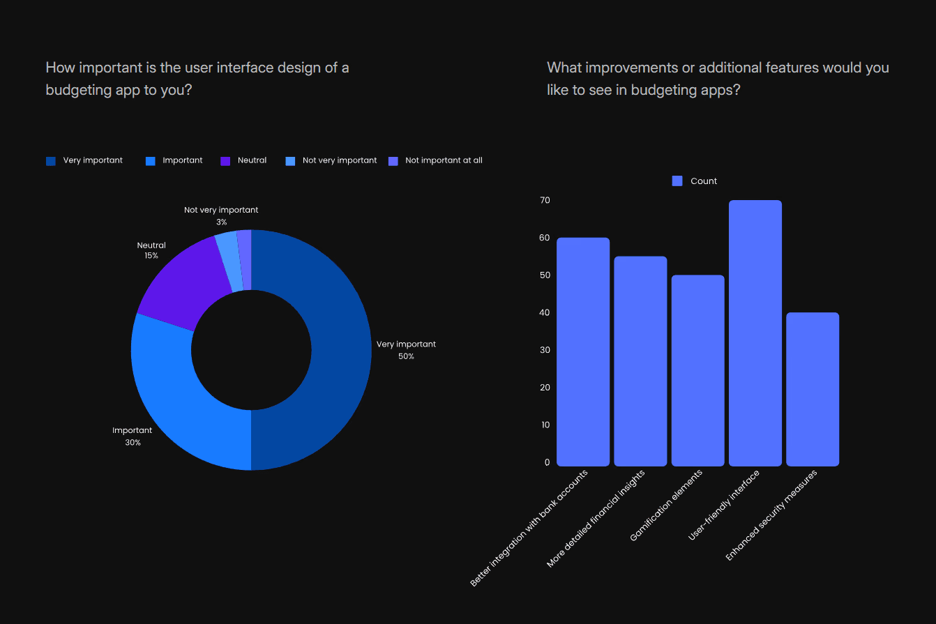
Following the competitor analysis, we conducted online surveys as part of our primary research. We framed a set of 8 questions and the online survey form was distributed across various platforms and contacts. After the survey, we had a total of 120 responses from which we mapped out certain pain points according to their repetition rate.
RESEARCH
/User Pain Points (Focusing on the relevant and impactful pain points)
Insights from both primary and secondary research helped us identify key pain points faced by potential users. We prioritized the pain points we found using 2*2 matrix and finally focused on the top four pain points as follows:
48%
According to user feedback, 48% of finance app users reported that one of their biggest challenges was tracking transactions. Many found it frustrating to log expenses consistently, leading to incomplete records and complicating financial management.
Challenging Transaction Tracking
40%
Measures how easily users navigate the app without confusion or frustration. This can be tracked through session recordings, drop-off rates on complex screens, and user feedback on ease of use.
User Interface Complexity
30%
Measures the app’s ability to provide personalized insights or recommendations. Track user engagement with personalized features and any uplift in retention after personalization improvements.
Personalized insights
64%
A significant number of users express a desire for improved visualization of their spending habits in finance management apps. According to a survey by Plaid, 56% of consumers rely on digital financial tools to navigate financial challenges, with 84% of these users reporting that such tools help them better understand their spending.
Need for Better visualization
/ Desk Research (Understanding more about budget splitting & expenditure tracking)
RESEARCH
Understanding how users currently track and split expenses was crucial before designing a solution. To support this, the team conducted a detailed competitor analysis, which proved valuable during the mobile app design phase.
User Interface
Buckwheat
Budgeting
Analytics

Onboarding
Go budget
Tutorial
User experience

Charts
Fitness app
Goal tracking
User experience

Goal tracking
YNAB
Reports and insights
Real-time synchronization

Net worth tracking
Monarch Money
Investment tracking
Flexible budgeting tools

Expense splitting UX
Splitwise
Balance tracking
Grouping and collaboration

We referred to multiple applications to study their user experience, balance tracking, reporting features, insights, and data visualization. This research helped us identify best practices and guided us in shaping the direction and potential of our own application.
SYNTHESIS
/User Persona (Defining the challenges and goals of our ideal users)
The goal was to establish a representative user persona for the ideal CashCare user, informed by the comprehensive research process we undertook, incorporating findings from issue identification, user surveys, competition analysis, and primary problem areas. By aggregating the collected information, we aim to portray the user's likes, pain points, and habits, enabling a more targeted and efficient revamp for our ideal user.
“It’s important for me to have
real-time updates on my
spending to avoid overspending.”
“I want a simple way to track shared expenses with my flat mates."
“I want to save for my future trips without compromising my current lifestyle.”
Priya Sharma, 25
Marketing manager at a mid-sized tech company. She lives in a shared apartment with two flatmates. Priya is tech-savvy and uses various apps to manage her daily tasks. She enjoys socializing with friends, traveling, and attending team outings. Despite her busy schedule, she strives to maintain a balanced financial life.
Marketing manager
MBA
Bengaluru, India
To manage and track shared expenses with flatmates and friends effortlessly.
To save for future travel plans and personal goals.
To gain better control over her monthly budget and spending habits.
Goals
Regularly uses mobile apps for banking, shopping, and social media.
Prefers apps with intuitive and user-friendly interfaces.
Values real-time notifications and personalized insights to stay on top of her finances.
Behavior Patterns
An app that offers seamless expense splitting and tracking.
Real-time synchronization with bank accounts and financial platforms.
Personalized financial advice and insights based on spending habits.
A secure and reliable app that protects her financial data.
Preferences
Difficulty in keeping track of shared expenses and ensuring everyone pays their fair share.
Finding a budgeting app that syncs with her bank and gives real-time updates.
Managing her finances efficiently without spending too much time on it.
Challenges
SYNTHESIS
/User Journey (Mapping the journey for the user persona)
We mapped their journey to gain a deeper understanding of their day-to-day financial habits, emotional touchpoints, and the challenges they face while managing, tracking, and splitting expenses. This helped us uncover key moments of friction, identify gaps in their current tools or methods, and recognize opportunities where our solution could provide meaningful support and value throughout their budgeting experience.
Priya moves into Bangalore for her new job with 2 other flat mates, who she splits expenses with.
She comes across apps which can do splitting or budgeting.
She understands she now needs a medium to grow her wealth and something to track it all.
She understands that the current app is not quite fulfilling all her financial needs
She again start searching for better alternatives.
She does not understand where she is loosing money
She would like to see how her money cycle looks like
She understands there is need for her to split the flats expenses with her flat mates, she finds it hard to maintain a budget.
She finds these apps difficult to understand and the interface hard to navigate.
She starts searching for applications that can do all these for her.
Good User interface and User experience
Finance management
Analytics and informed charts
Ease of access and navigation
All in one
Curious
In need
Figuring it out
Optimistic
Disappointed
Nervous
Frustrated
disappointed
Sad
She finds it hard to note down all her expenses as there are multiple touchpoints that she is required to navigate through.
🤔
🙁
🫣
🧐
🙃
🤧
😭
🥲
🙂
IDEATION
/Problem Statement (Stating the final problem identified)
Users often find it difficult to manage their personal finances due to fragmented expense tracking, unintuitive interfaces, and a lack of meaningful feedback from budgeting tools. This leads to incomplete records, confusion, and reduced engagement with finance apps. There is a clear need for a smarter, more user-friendly solution that simplifies expense tracking, offers intuitive visualizations, and provides personalized insights to help users make better financial decisions with ease and confidence.
IDEATION
/Design Goals (Proposing certain ideas for solving the problems identified)
Simplicity and Intuitiveness: Ensure the app is easy to navigate, even for users who aren’t tech-savvy.
Personalization: Allow users to customize their experience
Seamless Expense Splitting: Make it effortless to split bills and track shared expenses.
Real-Time Notifications: Keep users informed about their financial status and any changes in shared expenses.
Clear Tracking: Provide detailed records of all transactions to avoid misunderstandings.
Dispute Resolution: Implement features that help resolve any discrepancies or disputes over shared expenses.
Bank and Card Integration: Enable seamless integration with various banks and credit cards for automatic transaction tracking.
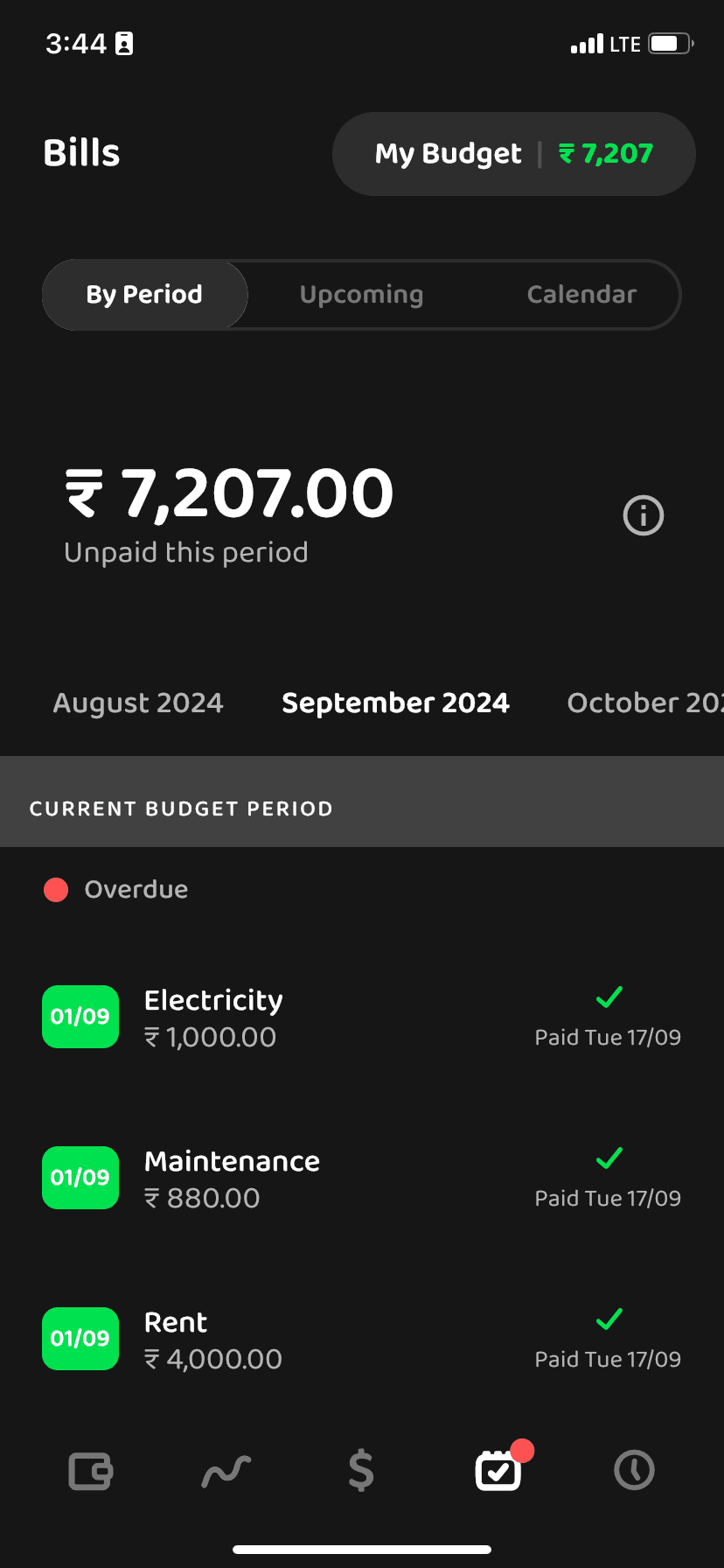
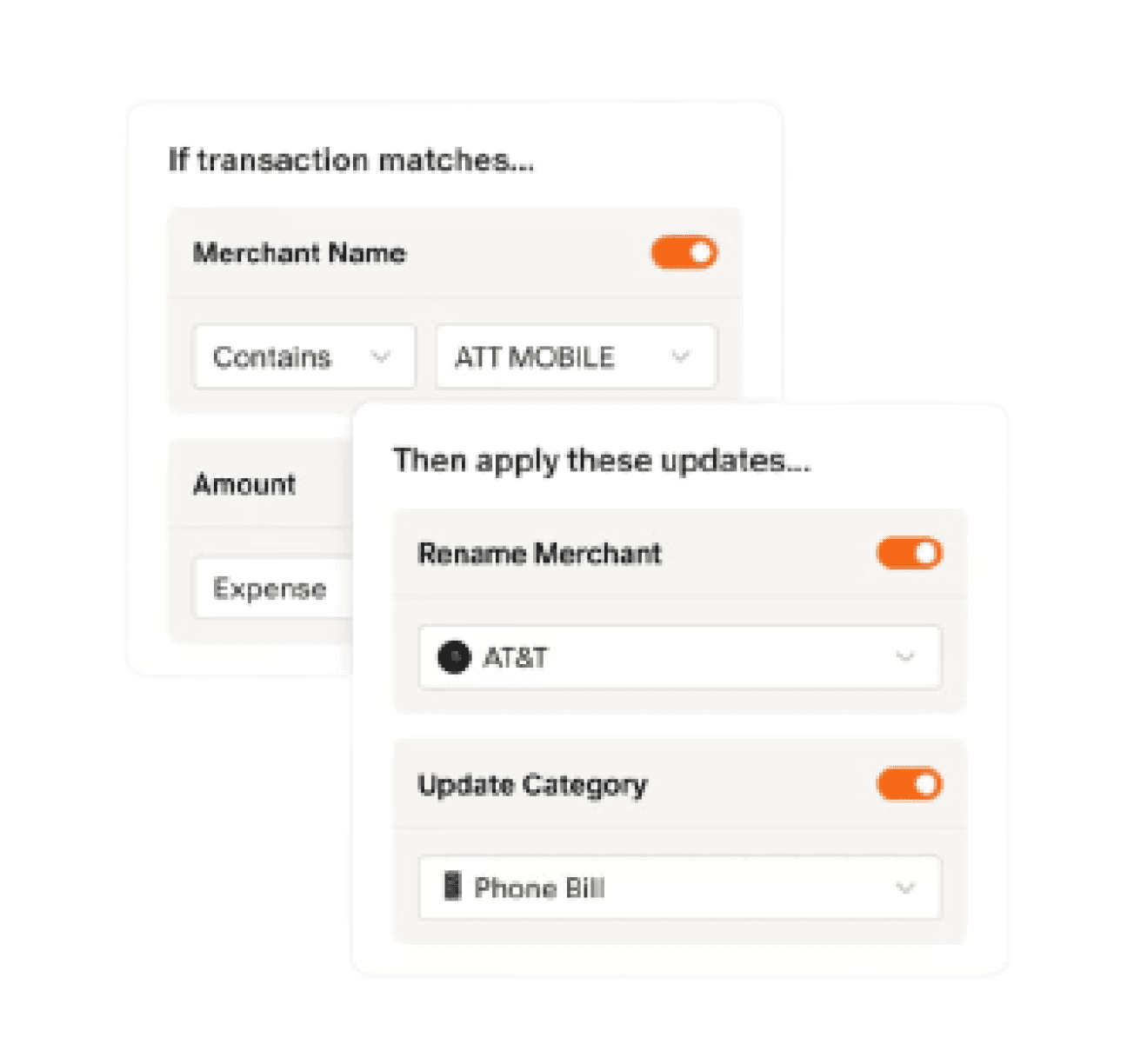
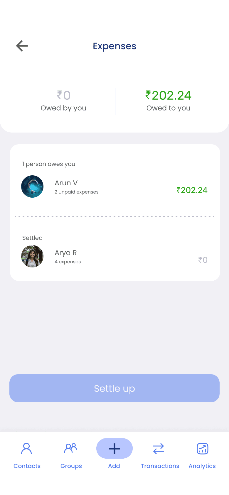
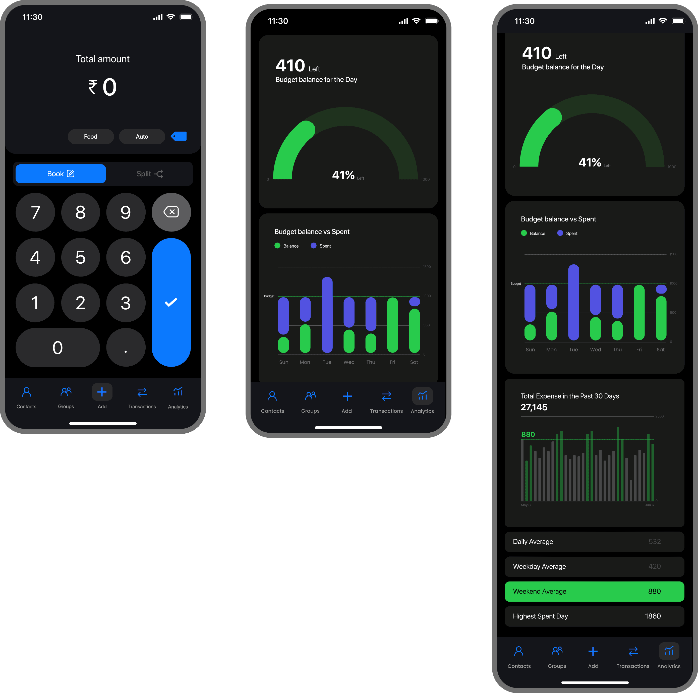
EXECUTION
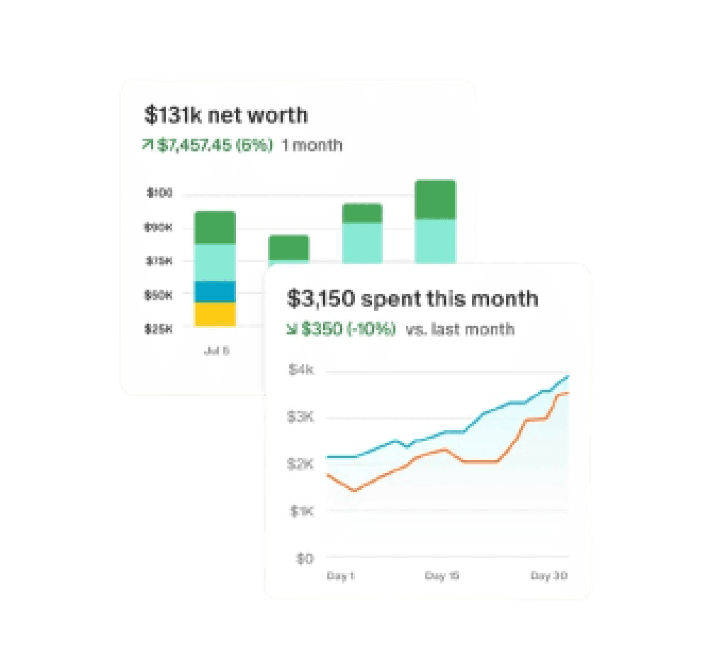
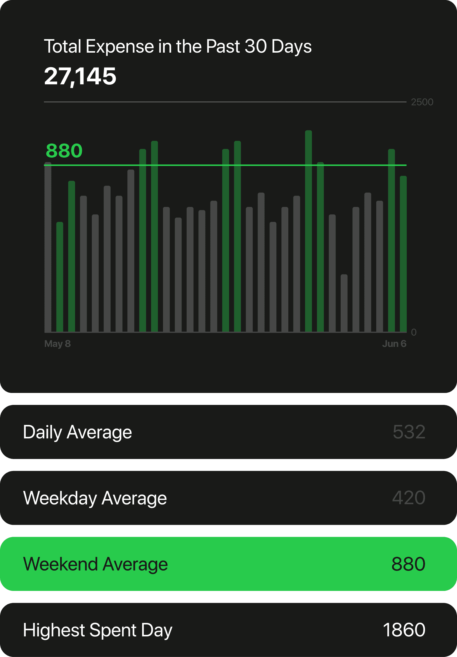
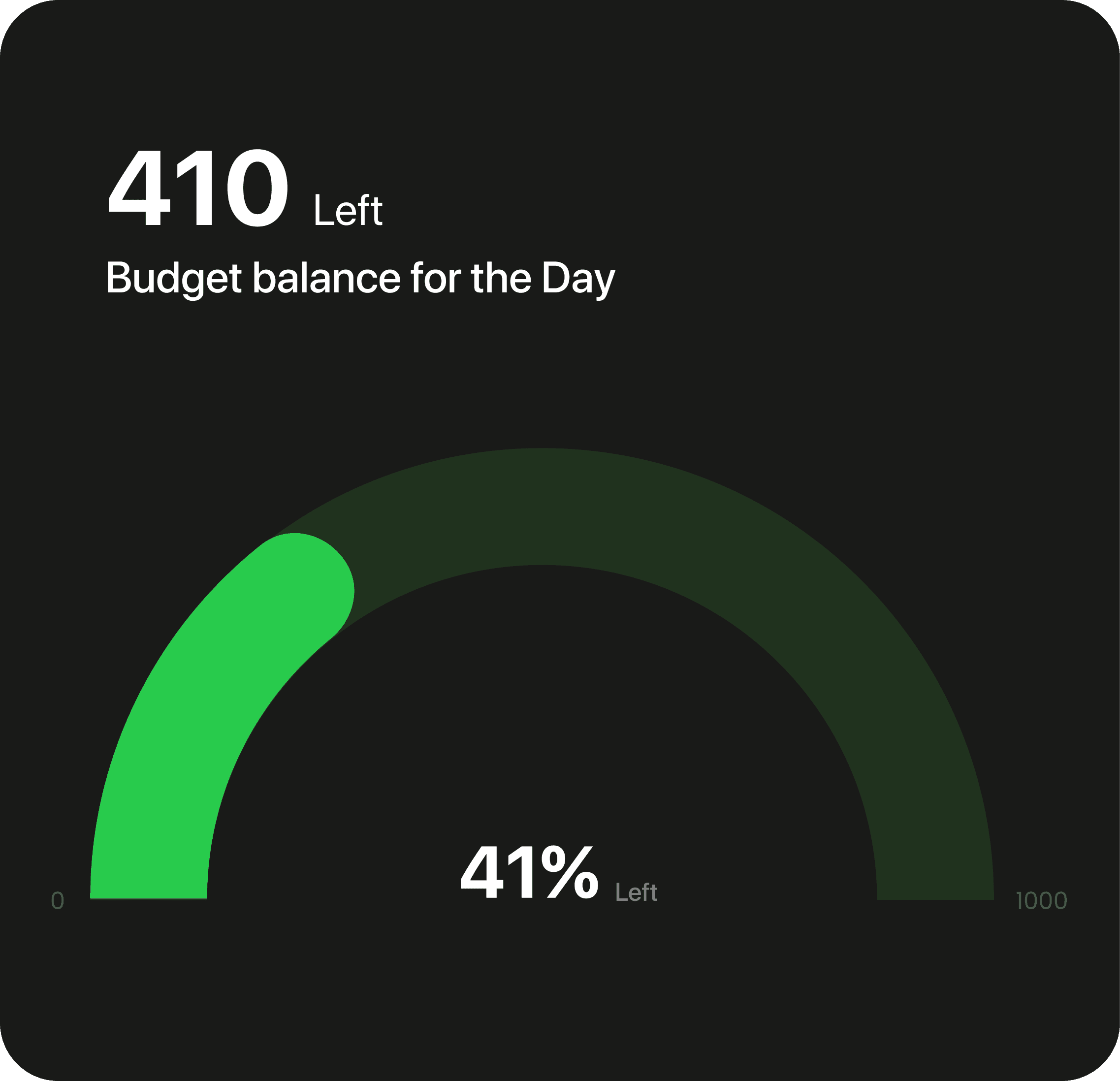
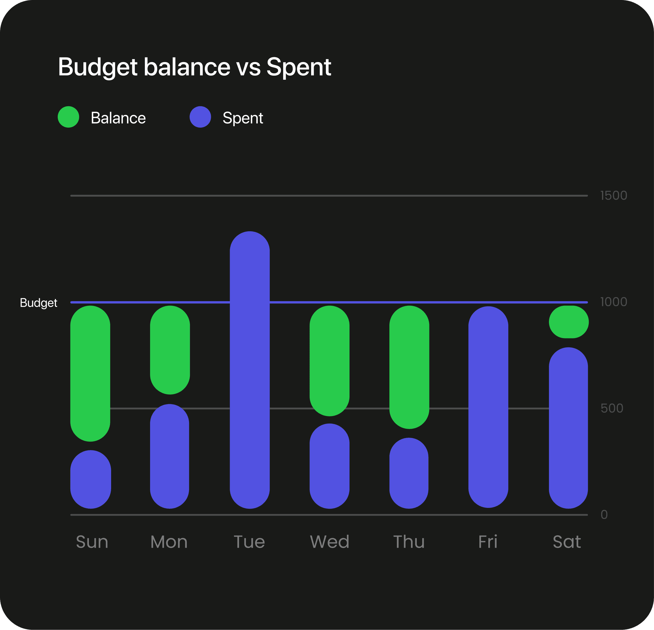
/Analytics Screens (Visualizing the data)
Analytics screens are key to the app’s success, so we had to design them carefully. We held multiple discussions to focus on the important insights about user behavior and our product goals. We've narrowed it down to a few key graphs, and we're still working on some of them.
All the charts were created according to the Swift UI guidelines set by Apple WWDC22, the guideline of Apple Car play was also studied as the apple Car play dashboard is dynamic and can be personalized from one auto brand to another.
EXECUTION
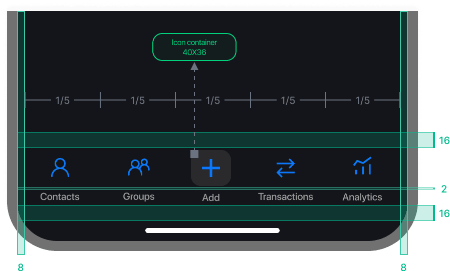
/Navigation (Designing the flow of the app)
Cashcare's navigation is designed for simplicity and efficiency. Users can quickly launch the app, input the amount and a note for reference, and then move on. If they want to add more details later, they have that flexibility. The additional tabs in the navigation bar offer extra features that enhance how users manage and view their budget.
EXECUTION
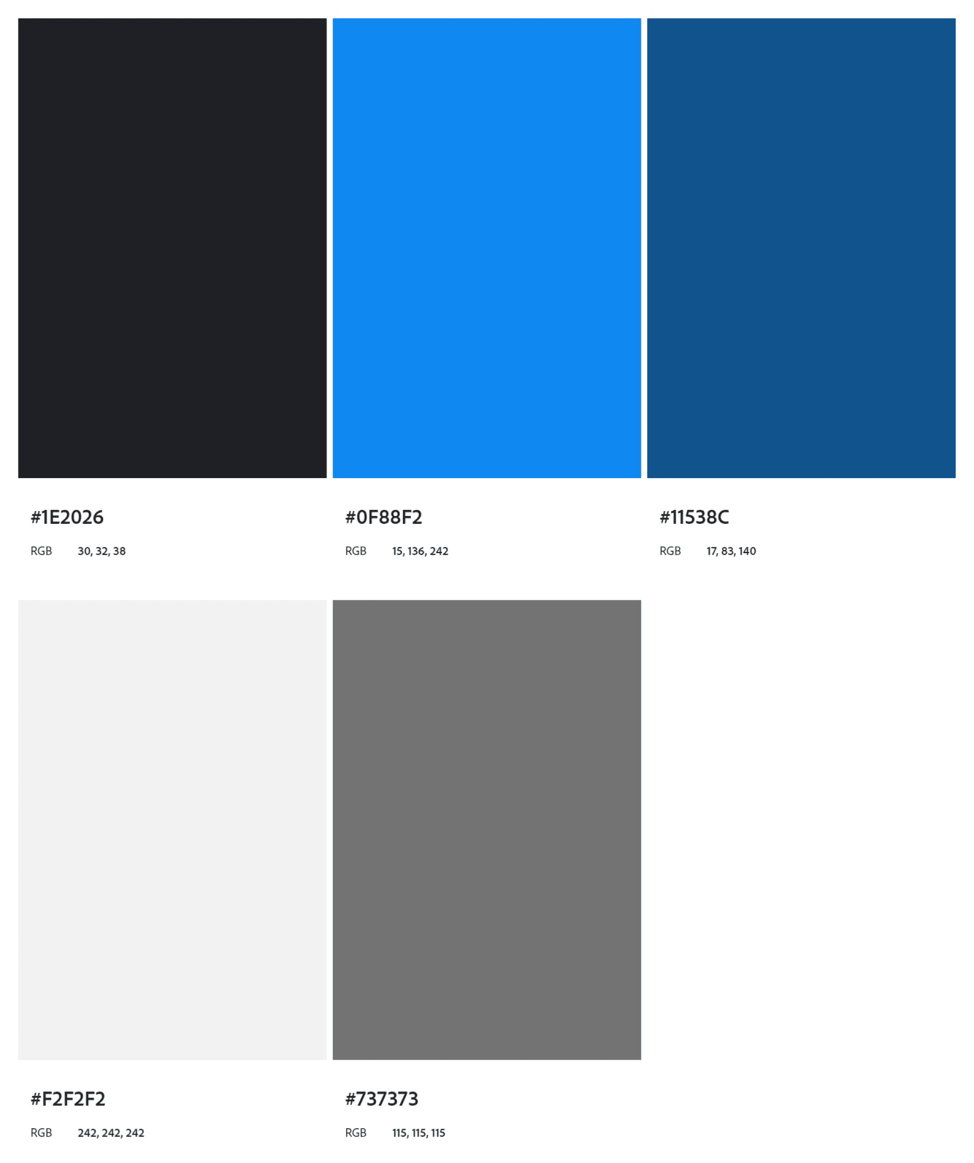
/Design Decision (Color and aesthetics of the app)
Based on our extensive research, we decided to use variants of blue for both dark and light modes, selecting #0F88F2 as the primary color. This hue isn't just aesthetically pleasing and strategically reinforces our app's values of trustworthiness, professionalism, and user comfort. It’s a color that will resonate well with our audience, elevate the overall user experience, and more:
Trust and Security: Blue is often associated with trust, reliability, and security. These are critical qualities for a budget management app, where users need to feel confident about the security of their financial information and transactions.
Professionalism: Blue is a color that conveys professionalism and efficiency. It's widely used in corporate branding because it gives off a sense of stability and competence—exactly the kind of vibes we wanted to instill in our users as they manage their finances.
Universal Appeal: Blue is a universally liked color and tends to appeal to a wide range of demographics, making it a safe yet effective choice for our target audience.
Calm and Clarity: In the context of finance, which can often be stressful, blue can have a calming effect. It helps to create a serene and clear-headed environment where users can make well-considered decisions about their budget.
EXECUTION
/Iconography & Typography (Deciding the look and feel of the app)
We chose Inter as the font for Cashcare because of its sleek, modern look and excellent readability. It ensures that all the text is clear and professional, which is vital for a budget management app where precision matters.
For the icons, we mainly opted for line icons. They give the app a clean and minimalist aesthetic, making it easy on the eyes and simple to navigate.
We used filled icons in places where grabbing the user's attention was crucial
Inter
a b c d e f g h i j k l m n o p q r s t u v w x y z
a b c d e f g h i j k l m n o p q r s t u v w x y z
EXECUTION
/Design Decision (Spacing and layout of the app)
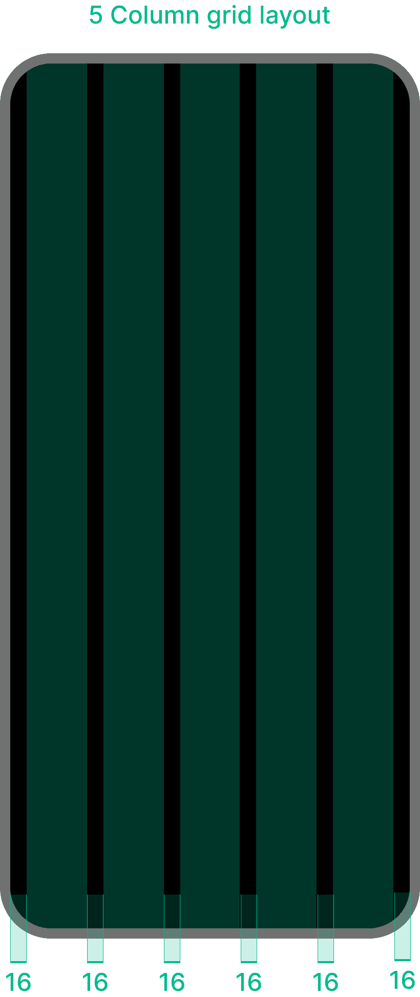
To create a cohesive and user-friendly design system. It’s all about making the best use of space, maintaining visual hierarchy, and ensuring a consistent and engaging user experience. Here, the grid layout, typography, iconography, and primary color choice—come together to create a cohesive and user-friendly design system.
We decided to go with a 5-column layout for our iOS app, with 16px margins and gutters, aligning with Apple's design guidelines. The navigation bar has 5 icons, fitting perfectly with the 5 columns, providing a balanced and intuitive user experience.
Using the 16px margins and gutters ensures our app feels clean and organised, making it easy for users to navigate and manage their finances. The 5-column layout also scales well across different screen sizes, maintaining consistency and clarity.
Low Fidelity

Mid Fidelity
EXECUTION
/Wireframes (Creating UI for the application)
Some of the initial thought processes regarding our research and the goals for our app. The low-fidelity designs gave us the first glimpse of how Cashcare could work with all the critical functionalities implemented. A user-friendly interface designed to simplify expense tracking and bill splitting. Key screens include a dashboard for an overview of shared expenses, an expense entry form for adding and splitting bills, real-time notifications for payment reminders, and personalized financial insights. These frames emphasize simplicity, transparency, and effective financial management.
During research, we found that a key point of the user's need was personalization, in dark mode and light mode variations for Cashcare. So we decided to do the light mode and dark mode variations and below you can see the screens we have created in dark mode.
High Fidelity
EXECUTION
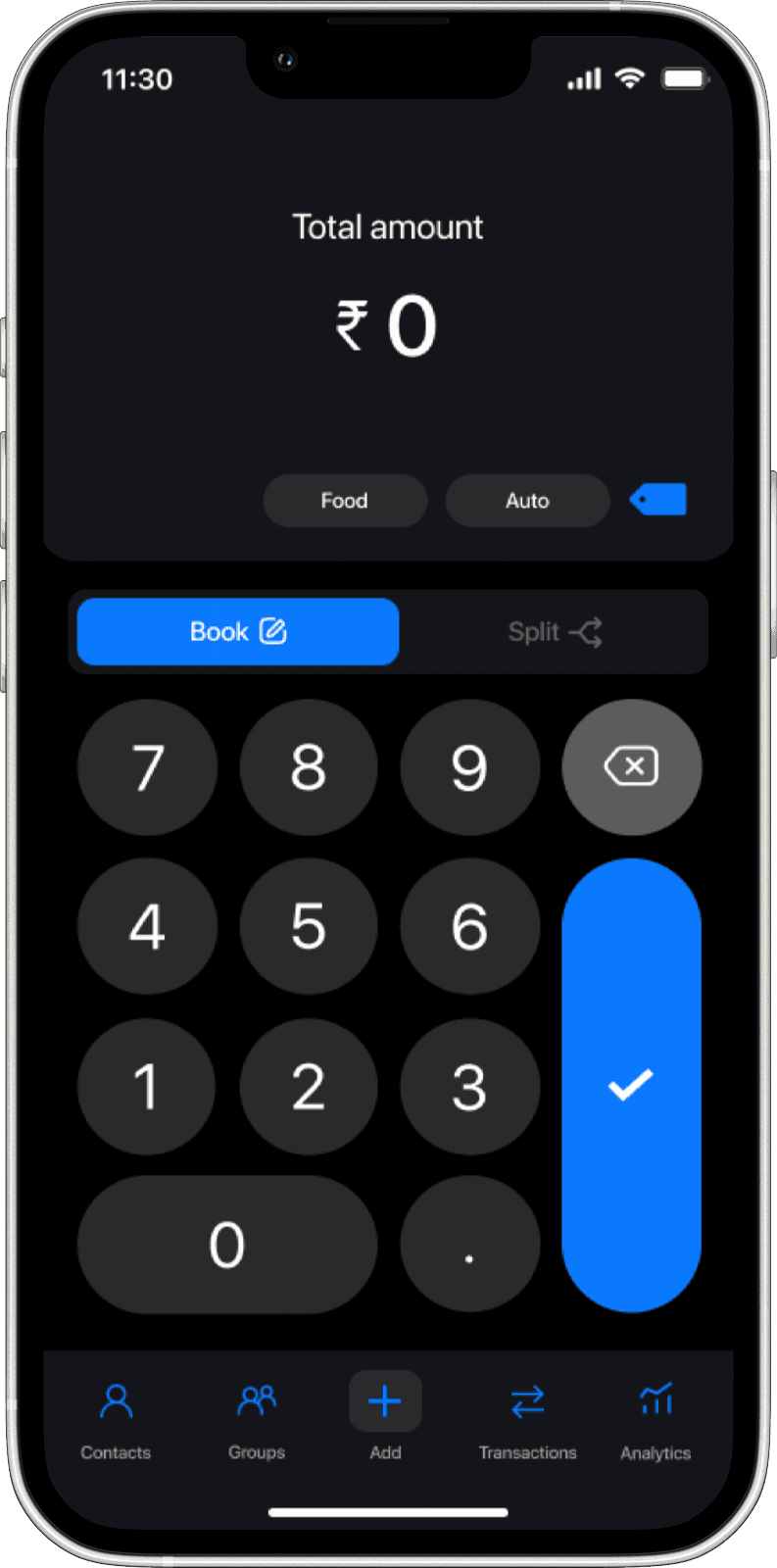
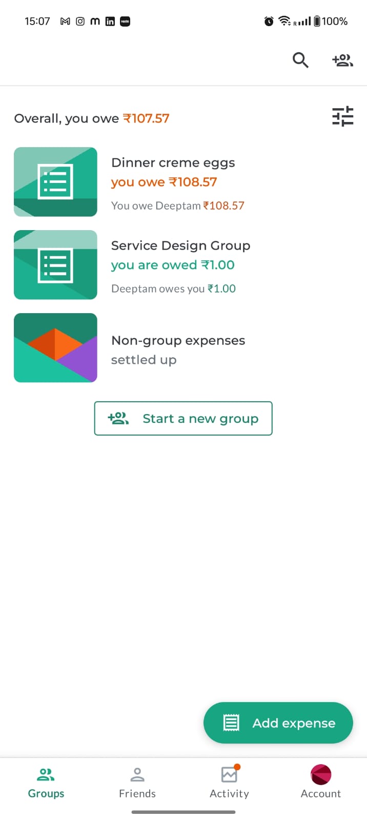
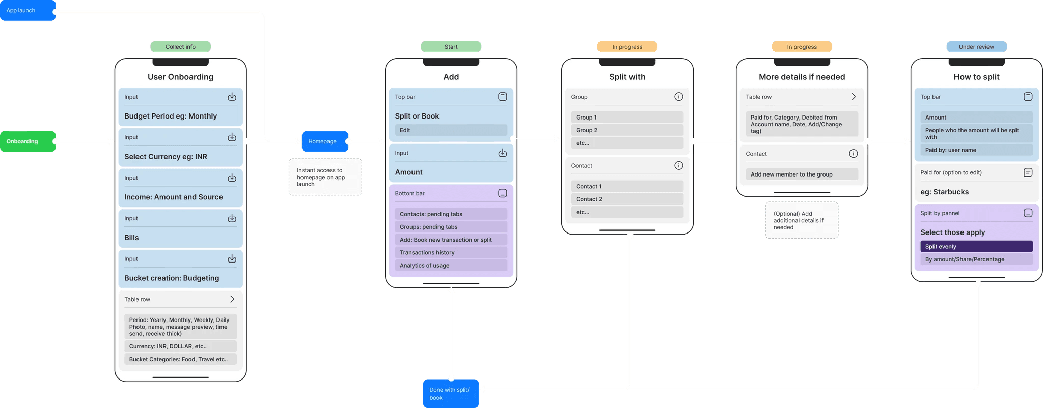
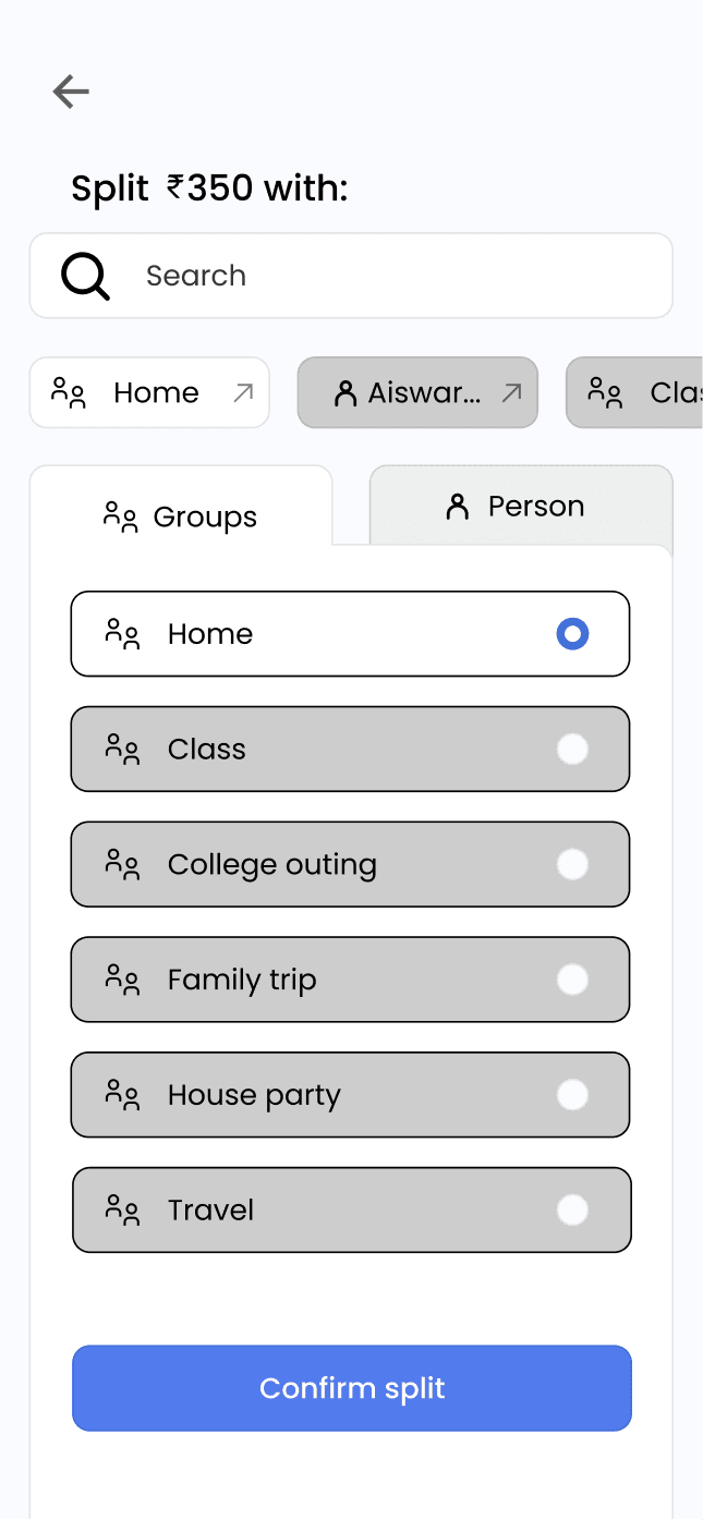
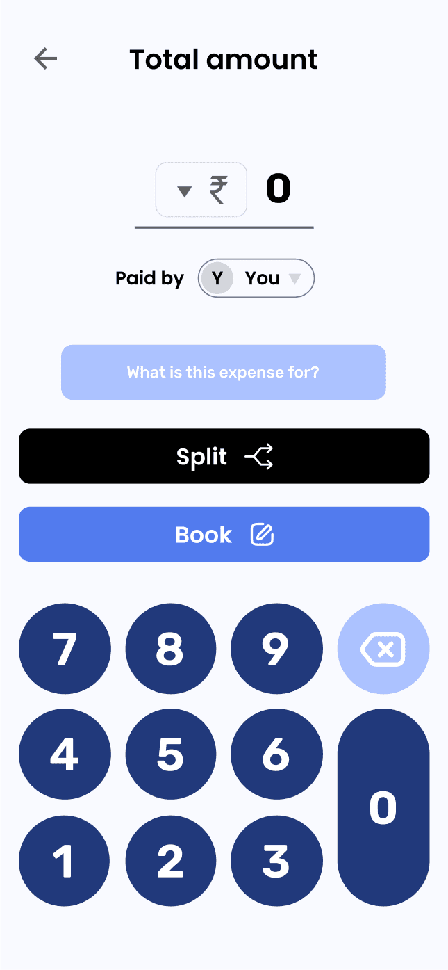
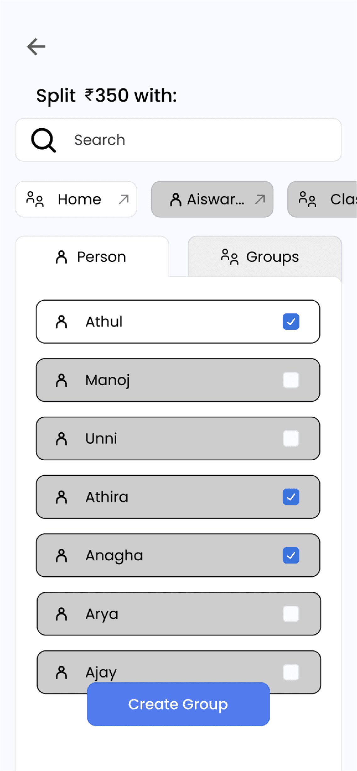
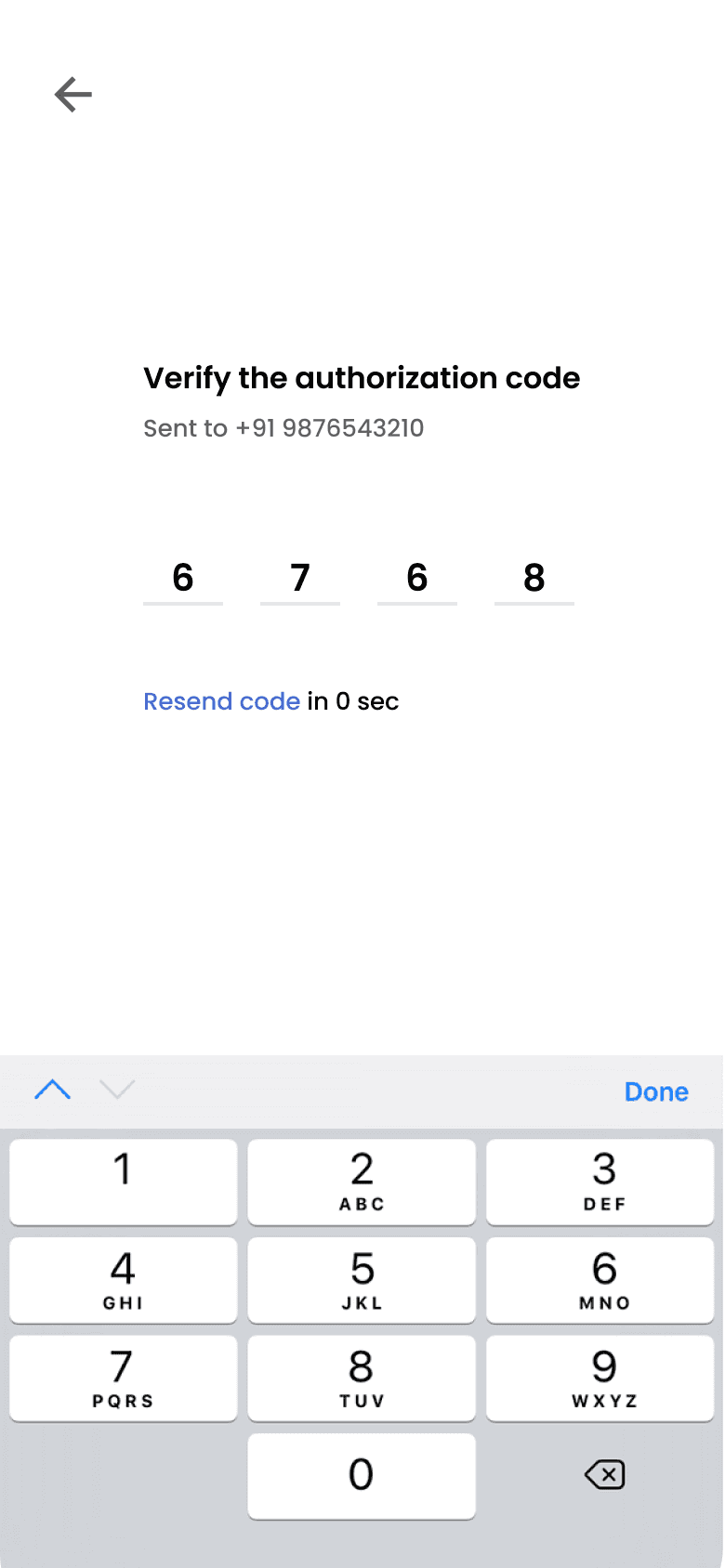
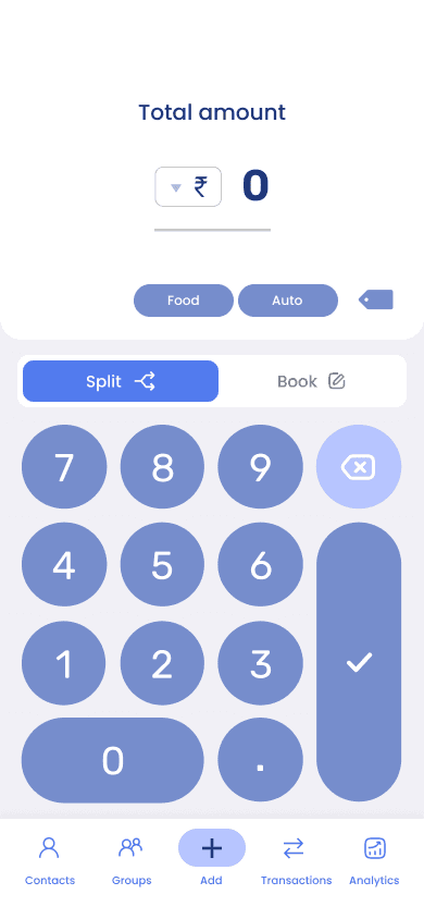
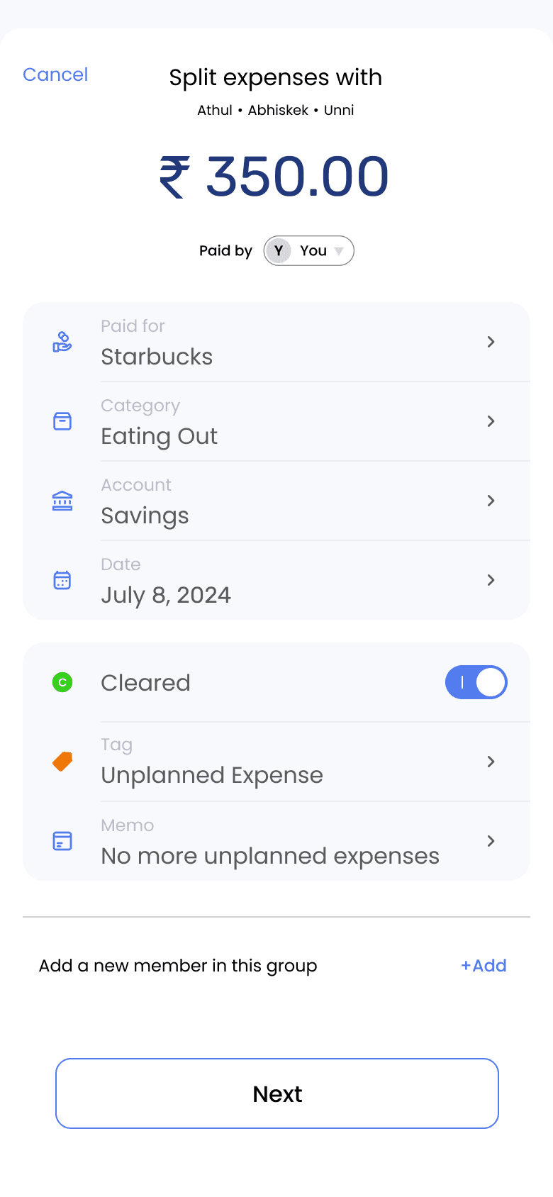
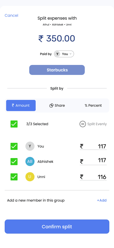
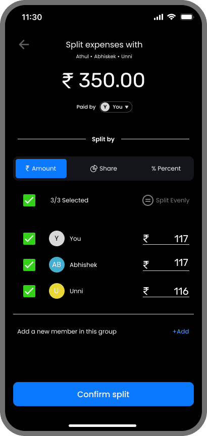
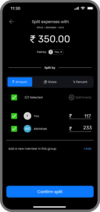
/Task Flow (Splitting expenses in Cashcare)
The product development is still in progress, but given below is a simple flow of splitting expenses to give you a gist of how Cashcare works.
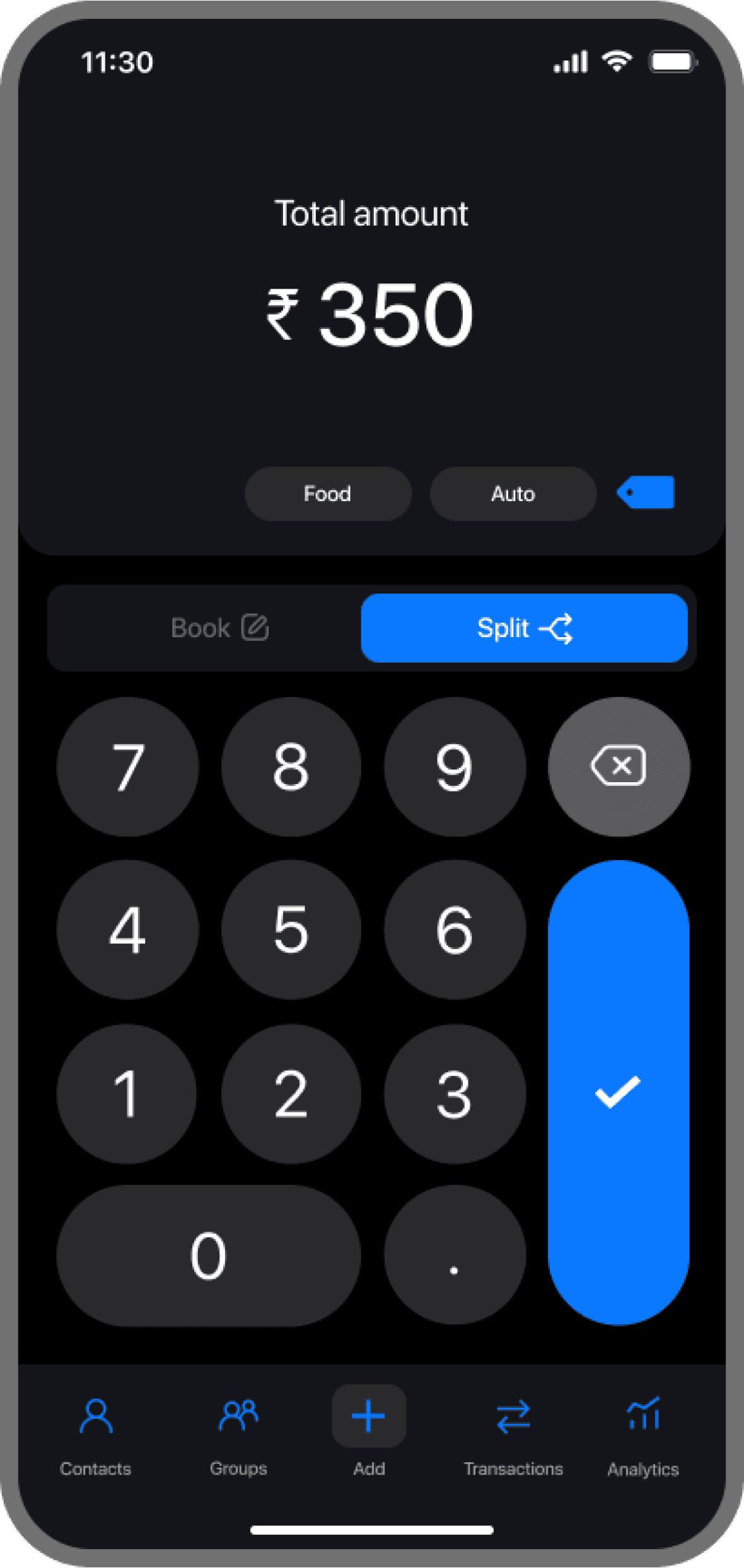
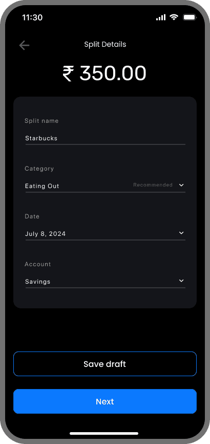
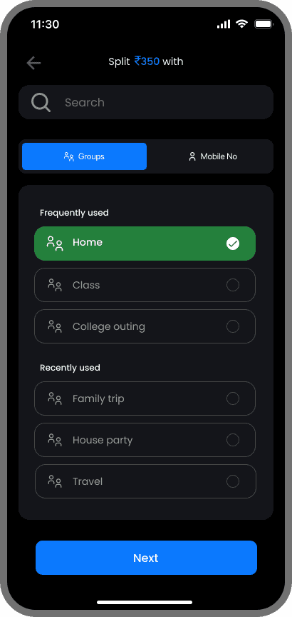
Users have the option to either split an expense or log it for personal tracking.
Users can enter expense details while splitting.
Split names trigger automatic category recommendations for faster input.
Expense splitting is available for both individuals and groups.
Users can opt for equal splitting or customize the split as needed.
Frequently and recently used groups are shown upfront for quick access.
Expenses can be split by amount, share, or percentage.
EXECUTION
/Testing & Reflection (Post design outcome)
The product development is still in progress, and the launch is set for May 2026. Any updates and insights gained post-launch will be updated here.